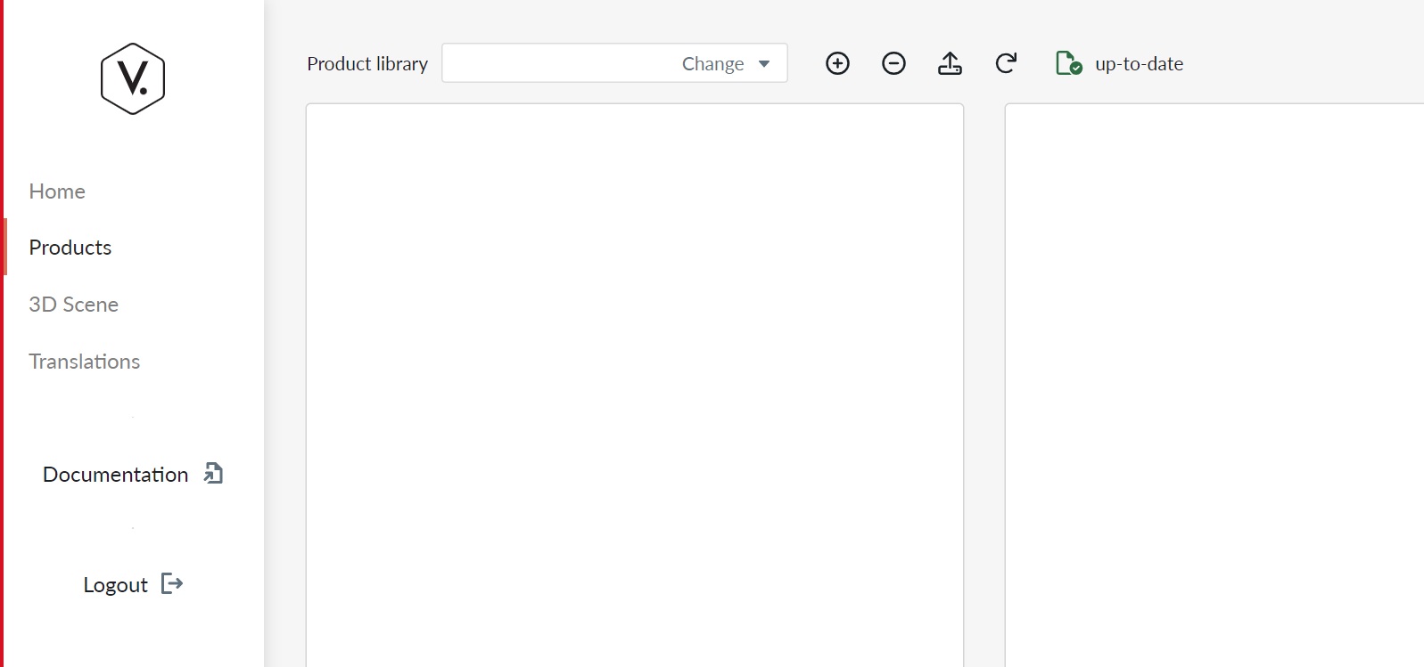
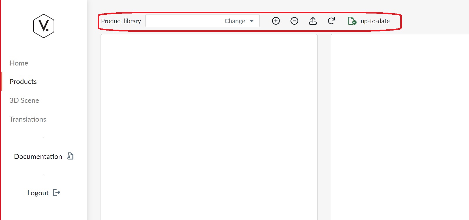
Product libraries view in Manager UI
Selecting the Product Catalog menu it will show a list, where you manage your product libraries.
Product Libraries list
The Product Libraries list is the starting point for all product-related work. From here you create new libraries and navigate into a specific library to edit products.
When you enter your tenant and have no product libraries defined, the screen shows an empty state with a prompt to create your first library:
Click Create a Product Library to open the creation dialog.
Once libraries exist, the list displays them with a New Library button in the top-right corner:
Clicking New Library (or Create a Product Library on the empty state) opens a dialog where you enter the library name and confirm creation.
Library actions (trailing menu)
Each library in the list has a menu button on the right side (⋮). Opening it reveals the following actions:
- Tags – Open the tag management view for this library. Tags are used to map SKUs in sales code mappings.
- History – View the edit history of the library and roll back to a previous version if needed.
- Rename - Rename a library.
- Replicate (Admin only) – Replicate the library to another environment.
- Delete – Permanently delete the library after confirming by typing its name.
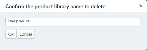
Note
Deletion of a product library cannot be undone. All products in the library will be deleted. Contact VividWorks support if you need help recovering a library.
Tag Management
Selecting Tags from the library menu navigates to the tag management view for that library. Tags are per-library labels used in sales code mappings to control product visibility.
Initial tag catalog bootstrap
When you open the tag management view for a library for the first time, the tag catalog is automatically generated by scanning all SalesCodeMapping entries across every product in the library. Tag names are collected case-insensitively and the Common tag is always included. A loading indicator is shown while the initial scan runs. After the first visit the catalog is persisted and no further scanning occurs.
Existing sales code mappings that stored tags as plain strings are automatically migrated to use the library's tag identifiers (Guid references) during this bootstrap pass. After migration the string values are discarded and all tag references are stored as stable Guid-based IDs.
The view lists all tags for the library, ordered from oldest to newest, showing the tag name, description, and reference count (the number of product items whose sales code mappings reference that tag).

Click New Tag to create a tag. Clicking an existing tag in the list opens an edit dialog where you can:
- Rename the tag.
- Change the description.
- Delete the tag.

Assigning tags to a sales code mapping is done via the Tags field in the Properties panel. The field shows a tag picker displaying all library tags; select or deselect tags by clicking the picker button or the remove button on each badge. Free-form tag entry is no longer supported — only library-defined tags can be assigned.
Note
Deleting a tag removes all references to it. The frontend removes SalesCodeMapping and SiteVisibility references before the tag is deleted, so existing mappings are cleaned up automatically. As a precaution, verify your site configurations after removing tags.
View Product Library History
Selecting History from the library menu opens a history dialog showing the author and timestamp of each edit. From there you can roll back to an older version if you have made an unrecoverable error.
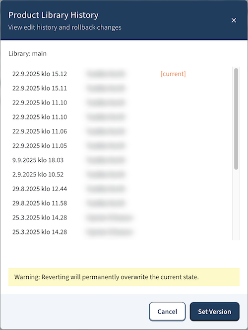
Note
Rolling back forks the version history. You cannot return to the version you rolled back from. Use this feature with caution.
The Product Tree
Clicking a library in the list navigates into the Product Tree view for that library.
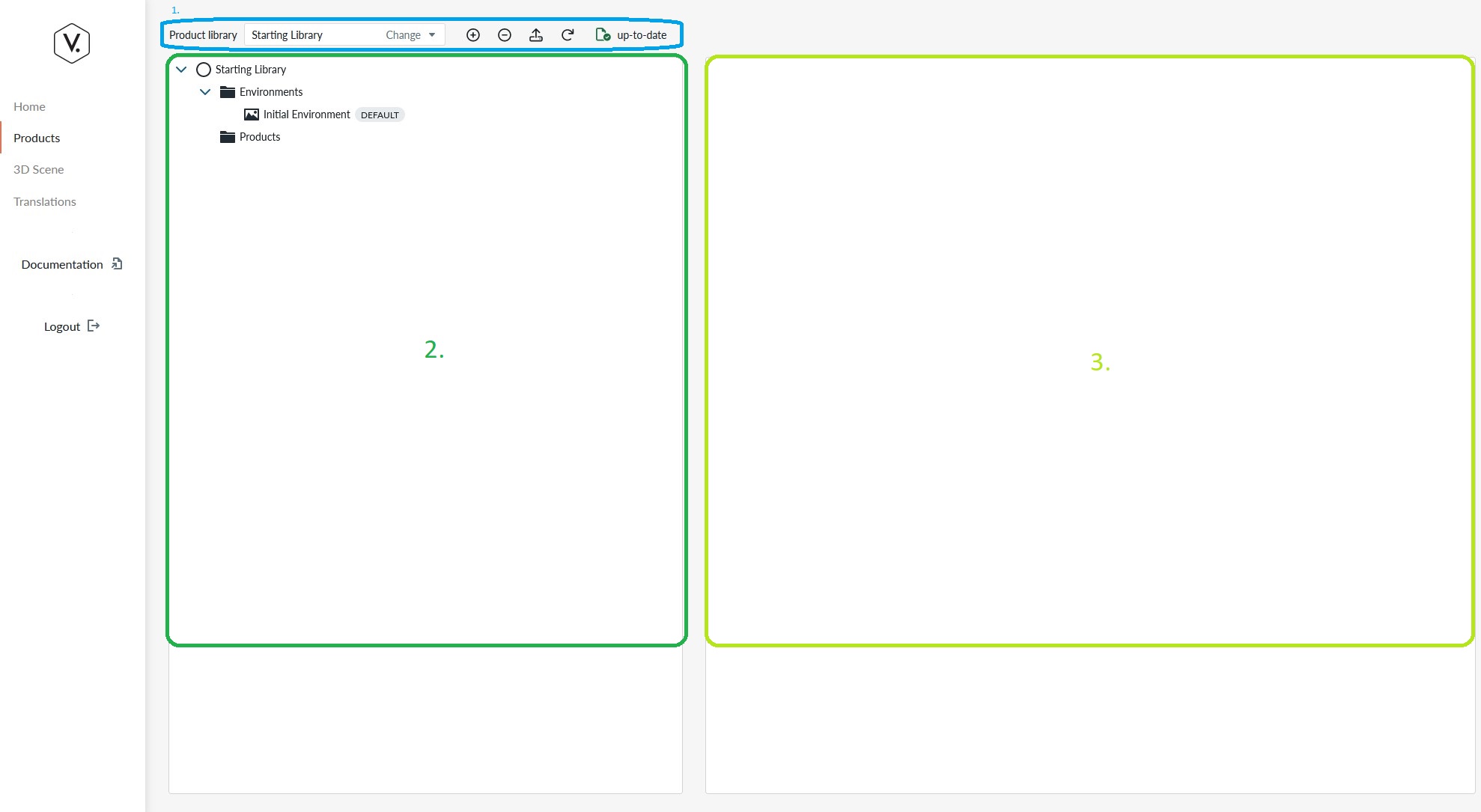
The Product Tree view contains three areas:
- The Product Menu bar
- The Product Tree view panel
- The Item Property view panel
The Product Tree view panel
The product tree view panel contains information about products and items under the product in form of a parent-child relationship through which the system knows which items are considered elements of the product.
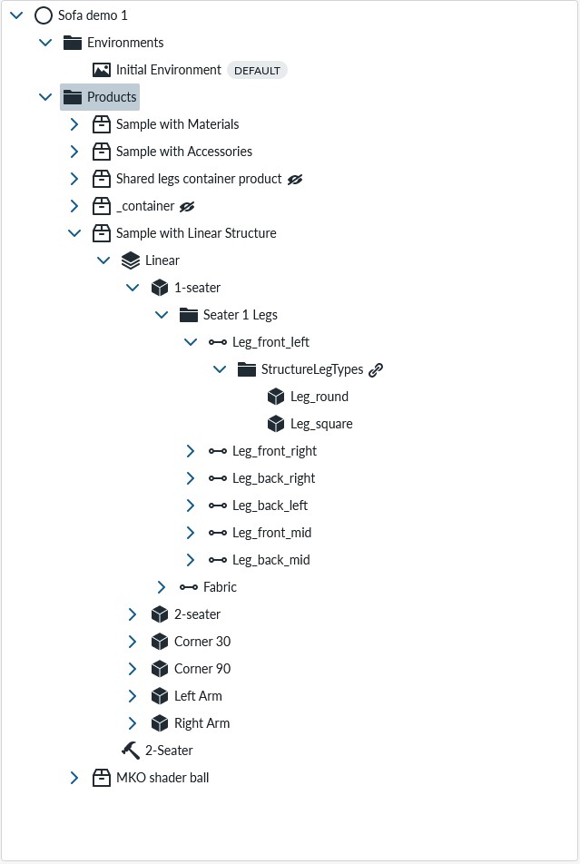
You will place many items here that are further explained in the introduction to parts and property sets. You can find more information how to manipulate the product tree from basic usage
The Item property view panel
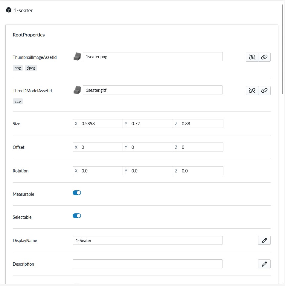
For each item in the Product Tree view panel, the specific configuration parameters of that item will be listed and edited in the Item property view panel.
The panel content depends on the selected item on the Product Tree view panel. You can read about the specific properties from the Property set documentation
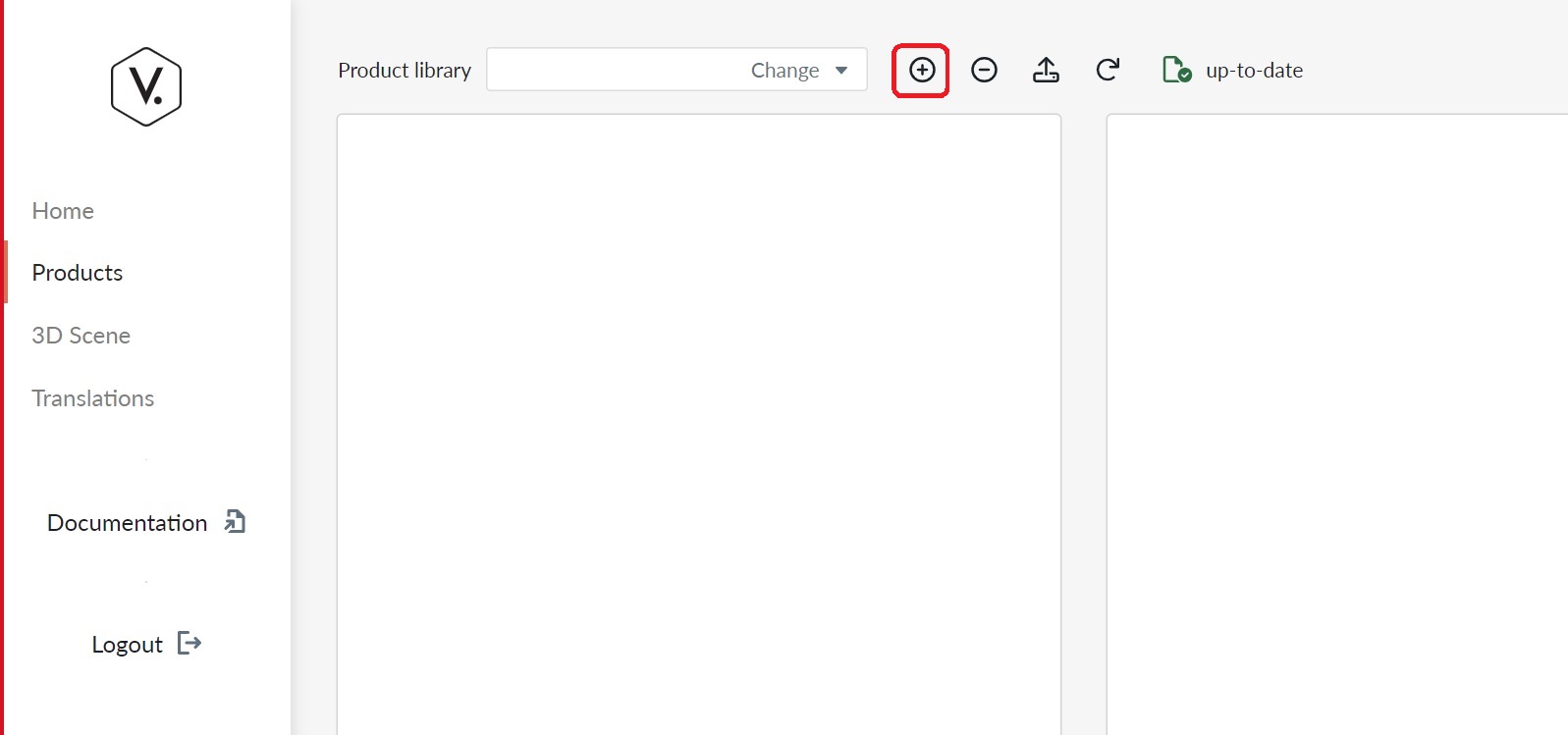
Product Menu bar
The Product menu bar contains controls for working with the products inside the selected library.
The Menu bar consists of the following items
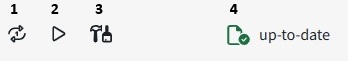
- Regenerate Runtime Products
- View selected product
- Add a prebuilt component
- Status indicator
Note
The Product Menu bar is contextual and only items that you can use are available. For example "Open Webapp for 'product'" and "View 'product'" button are only available when a product is selected in the Product Tree view panel.
Library-level actions (Create, Delete, Replicate, History) are accessed from the Product Libraries list, not from the product tree toolbar.
Upload new asset
There are two ways to upload assets into a product library. Using the Upload new Asset button opens upload modal that permits you to upload assets into the configurator.
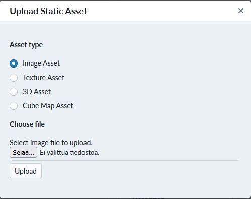
These assets are further explained in Introduction to content
Regenerate Runtime Products
For the time being, you will be heavily using this button. When ever you want to view some configuration in the 3D scene ("view 'product'" or 'Open Webapp for 'product'"), you need to regenerate runtime products and when using 'Open Webapp for 'product'' you need to also publish the product using the publish button on the product configuration view.
We recommend using View during development and regenerating runtime products before viewing the results.
Open Webapp for 'product'
With this button you will emulate production mode for product and view the Planner as a buyer would, without the website/e-commerce platform as container. The Planner will open in a new tab and will consume the whole browser window as it's not contained in a DIV element. If you have not selected a product in the product tree view, the button will not appear and if you havent published a product, the planner will not be able to load a configuration into view.
Note
The Open Webapp expects that a configuration is published and you will not see anything unless you've published a product. Also pay attention that you publish your configuration changes again after edits as this feature does not autoupdate
View 'product'
With this button you open 3D scene in the Manager to view the configuration settings, but not through production mode. This is very useful when configuring the products and setting up 3D parameters of parts, accessories and materials as you can view the outcomes, return to edit and view the outcomes. The button only appears if a product is selected in the product tree view
Note
View 'product' is useful for testing/staging. Remember to click on "Regenerate Runtime Products" between edits and View as otherwise no updates will show for you.
Status indicator
The status indicator will tell if an operation is on-going (spinner) or if the configuration is saved and is up-to-date.
Add a prebuilt component
A pre-built composition is a pre-configured starting state for a product that the end user can select as an alternative to building from scratch.
You can restrict which sites a pre-built composition appears on by using the SiteVisibility property set:
- Select the pre-built component in the Product Tree.
- In the Item property view panel, add the SiteVisibility property set.
- In the Tags field, pick one or more tags from the library tag catalog.
- On the site, navigate to Site Configuration > Product Catalog > Tags and enable the corresponding tags.
- Publish the product for the changes to take effect.
SiteVisibility can also be added to individual Parts and Materials in the Product Tree to restrict which options appear in the planner library for a given site. The setup steps are identical: select the part or material, add the SiteVisibility property set, pick tags, enable the matching tags in site configuration, and publish.
Behavior (applies to pre-built compositions, parts, and materials equally):
- An item with no SiteVisibility property set is visible on all sites (unrestricted).
- An item with SiteVisibility where at least one tag is selected is visible only on sites where at least one of those tags is enabled.
- An item with SiteVisibility but no tags selected is hidden on every site. Runtime regeneration will also emit a warning (W0025) to signal that the configuration is likely unintentional.
- The SiteVisibility tags come from the same library tag catalog used by SKU mapping (SalesCodeMapping). Enabling a tag on a site affects both.
Note
The built-in Common tag (always present in every library) can be used to make an item visible on all sites where any tag has been enabled. Select Common on the item and ensure Common is enabled in site configuration.
See SiteVisibility property set for a full reference and SalesCodeMapping property set for background on the shared tag catalog.